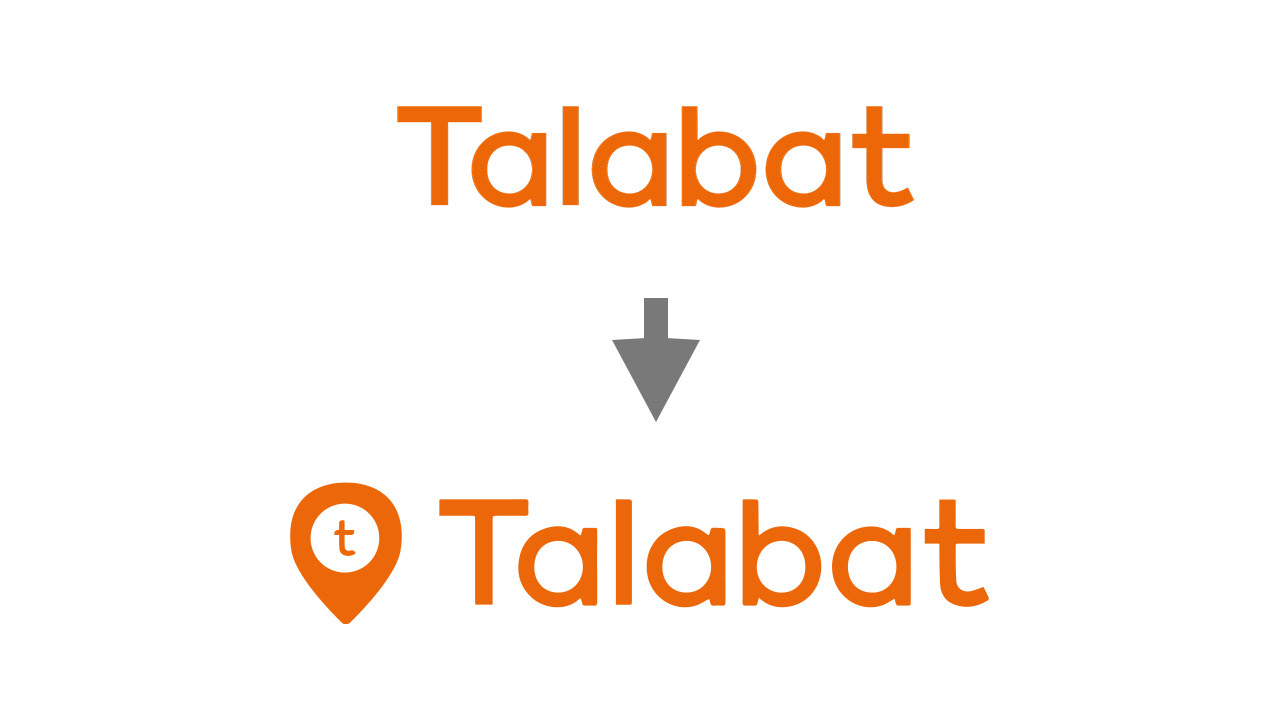
By adding this icon next to the old logo (slight text/font change), we have updated and given Talabat a more memorable logo. The icon is meant to symbolize a location pin. With using the "t" from Talabat, the message in this icon is to say that Talabat is everywhere, at every location, and most importantly in your home. Drop a pin, and we'll be there. Your neighborhood friendly delivery hero.
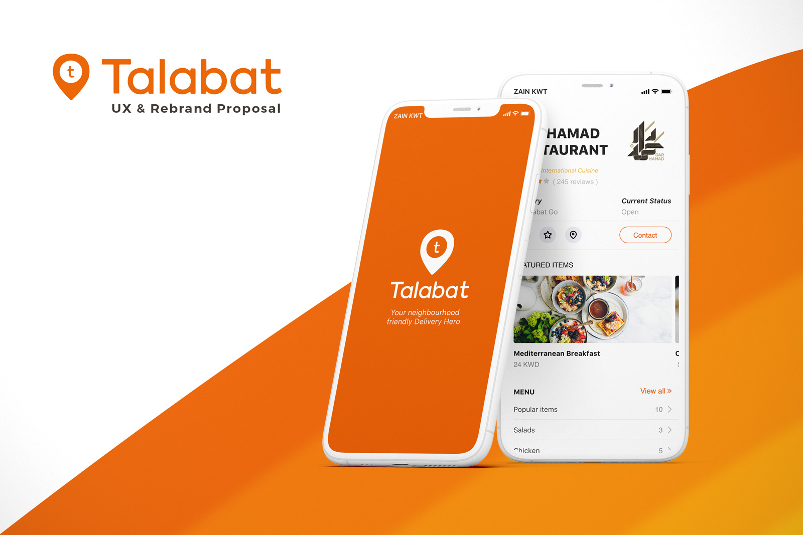
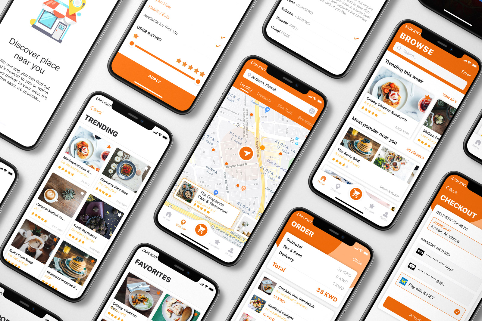
Of course changing the UI/UX of a longstanding application is not easy, which is why it is important to assess the most important aspects to change; those being the problems users had with the old experience. My findings show that the main issues are:
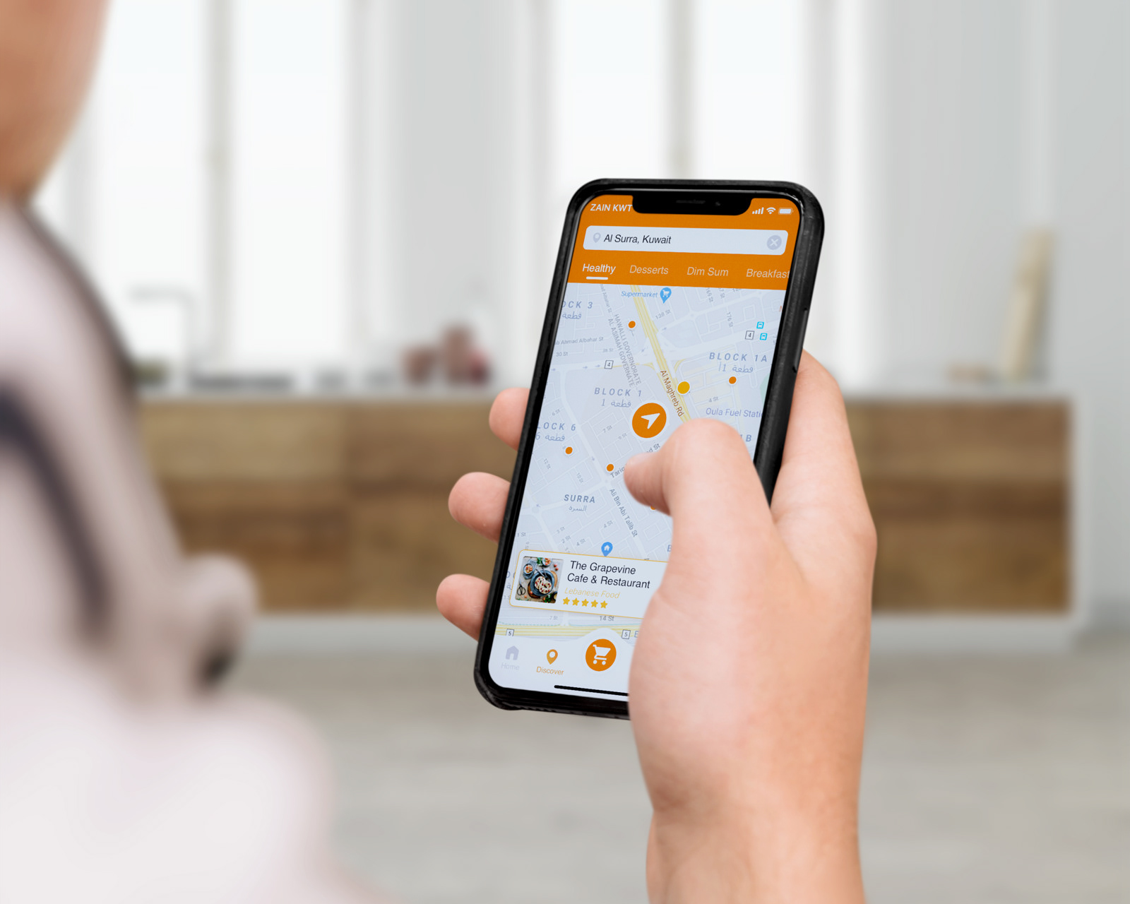
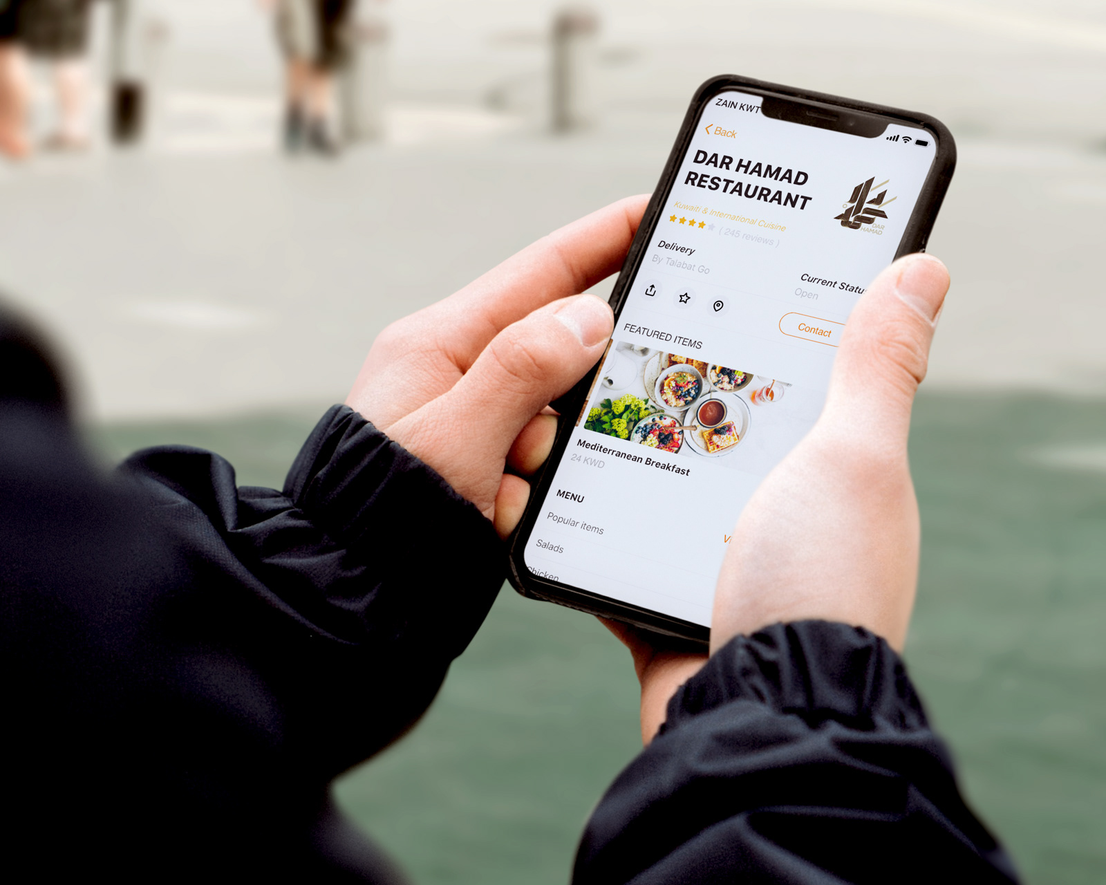
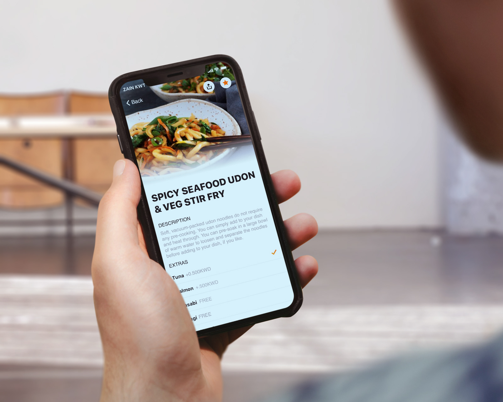
1. Lack of visual representation of the meals
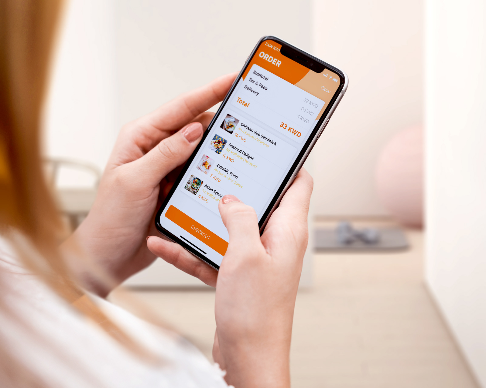
2. In store navigation required constant expanding, scrolling, and compressing in order to make orders of different types
3. Clear explanation through onboarding was needed, and an expansion of services needed to be added (such as pick up, loyalty program, discovery by area, easier sign up methods, and more curated content)
4. Displaying ratings for dishes, prices, and imagery all in one easy to view viewport
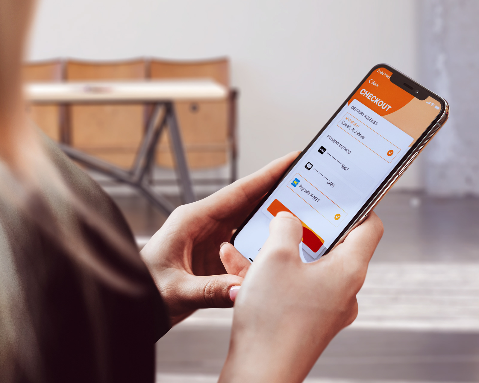
5. Faster check out model and improved profile and help areas to serve customers better
The following screens attempt to solve all of the above issues: